
Artists books are generally not what you expect them to be, they are something much more creative and art objects in their own right.
However, an artist’s book does not begin or end in its own materiality: it can expand, become other forms, and reassemble itself. An artist’s book can be the size of a matchbox or occupy a very large space. There is no fixed dimensionality, there are no patterns, there is no one who can tell us how to fabricate it.
An artist’s book may or may not look like a book. It is not enough to name it as such.as there must be a secret pact, a game between the reader and the artifact, so that the latter becomes a book.
Artists' books, include items such the traditional Codex form as well as scrolls, foldouts, concertinas, sculptural objects and installations of work or loose items contained in a box. Artists have been active in printing and book production for centuries. And artist books as works in themselves were created within earlier movements, such as Dada, Constructivism, Futurism and Fluxus. This is your response to our open call.
Artist: Nichola Rodgers
Instagram: @nicholarodgers.artist
Artist statement: I am a mixed media Artist, Curator, and editor whose work explores the symbiosis of nature, objects, and humans.
Name of the work: Echo’s
How many issues are there & has it been shown in public/exhibited? There are several pieces in the series. It has been exhibited in Folkestone and Glasgow
Why was your artist's book created?
This work is mixing found objects & nature, to create ‘Echos’ of humanity evolved as a symbiosis, each one unique.
In the series “Echos” I combine the ideas of a future evolved and contorted, of naturally grown forms with an artificial twist, ‘Echos’ of what humans used to be & nature has taken back. Creating hybrids that appear authentic, gives a pretence that the original object still exists and can be recognised. These forms, grant true "insights" and expose the seemingly abstract forms as human. The interwoven stories resemble a network, in which everything is interconnected, even elements that actually do not fit into the natural context. Precisely in this way, new levels of meaning are created. "Identity" arises through such connections and brings forth the freedom to engage in the unknown.

Artist: Semeurs de graines de rêves - Lan et Yves Grandclement
Instagram: @semeursdegrainesdereves
Artist statement: We are a pair of visual artists who work like one. Our aim is to plant the seeds that will grow into a path to an imaginary world.
In each and everyone lies hidden dreams, waiting to emerge. The ink, the paper and the brush established our story line, our path forward, through a single brush stroke.
« Work hard to open invisible doors » folding, origamic architecture, suminagashis, katagamis, paper sculpture, sumi-e, suiboku-ga are our creations.
IAPMA member (International Association of Hand Papermakers and Paper Artists).
Name of the work: The "Unique Book"
There is only one piece of each book of the "Unique Book" collection. Of course, the first time where some specimens of the « Uniq Book » collection were presented was a bookstore :)
Why was your artist's book created? We love books. We are not writers but artists. Making an artist’s book is a creative challenge and it’s lot of fun.
Each book we have made is unique, like each people is unique…

Artist: Cally Trench
Instagram @callytrench Facebook https://www.facebook.com/cally.trench/
Artist statement: A bird's wing is one thing made up of many feathers, just as a book is one thing made up of many pages. But while all the pages of a book are (usually) the same shape and size, the feathers that make up a bird's wing are shaped according to their function. In this book, each feather is different, an individual ink drawing. The book is constructed so that it can be read like a book or flapped like a wing. It exists in two forms - a right-handed and a left-handed form. If a reader holds both, will it give an illusion of flight?
Printed ink on watercolour paper, bound with glue and machine stitching.
Title: Book-Wing
There are two editions, each of six right-handed and six left-handed copies. 'Book-Wing' was shown, along with the other AMBruno 'One and many pages' books, in 2022, at the Bristol Artists Book Event; at Miss Read, Berlin; and at Printed Matter, New York.
Why was your artist's book created? I proposed the concept to the artists' book collective AMBruno as part of one of their themed projects, in this case on the theme of 'One and many pages'. The book also extends an interest that I have in flight, overhead viewpoints and metamorphosis into a bird.

Artist: Mike Clements
www.mikeclementsartist.com
Instagram : @mikeclementsartist
Artist statement: Fine art printmaker and book artist. My ideas come from close observation of the world around, often focusing on quirky aspects of life. I use both original prints and digital methods in my artist's books.
My artist’s books are in public and private collections worldwide, including Tate Gallery, Yale Center for British Art and Bodleian Library.
Name of the work: Colour Swatch
How many issues are there & has it been shown in public/exhibited? One issue, unlimited edition, exhibited several times
Why was your artist's book created? Made to highlight - and poke fun at - the ridiculous names domestic paint manufacturers give to their latest offerings, e.g. Aubusson Incarnadine, Boffrant, Chi, Dot.com, Sung. Self-invented structure that folds flat but can be displayed in several different sculptural formats.

Artist: Noel Molloy
https://www.noelmolloyart.com/
Instagram: @noelmolloy61
https://www.facebook.com/noelmolloyart
Artist statement: I work with found objects sculpture , performance art, film and sound. The work I create relates to social issues, politics and memories.
Name of the work: "At The Table"
Why was your artist's book created? The book was created for a group exhibition which was titled Wexford Artists Book Exhibition an annual open submission exhibition which toured between Ireland and England . The book AT THE TABLE was created at the time of political upheaval in Northern Ireland and the phrase AT THE TABLE was used a great deal referring to the various political parties sitting down together to talk, to lunch at the same table. The book is a simple idea of a lunch setting , on the right are found objects whose colours are of the Irish flag plus some Irish postage stamps to create the connection, on the left are found objects whose colours are of the English flag with postage stamps to create the connection. The found objects used are pacifically chosen to symbolize various meanings which is left entirely to the viewer to interpret. The last pages of the book are empty of objects .


Artist: Roy Willingham
www.porcovolente.com Instagram: @porcovolente
Artist statement: I work across a variety of media including painting, printmaking, collage and three dimensional works including artists books. Much of my work concerns landscape and its representation and can range from figurative through to abstract. Conceptual concerns may involve the boundaries between subjective and objective, the nature of memory, the interplay between humanity and the environment or whatever sparks my curiosity and interest.
Name of the work: Bok·s
How many issues are there & has it been shown in public/exhibited? There are only two copies of the book and it hasn’t been exhibited in public.
Why was your artist's book created? I was interested in the relationship between two and three dimensions, the space contained within and using nets to bridge the two so I decided to create a book which would also hold three dimensional space.

Artist: Alastair Noble
https://www.gnobilis-press.com/
www.instagram.com/dunoon_moca_/
Artist statement: My artistic practice is a response to architecture and the natural environment that reflects on particular sites in the context of poetry and literature. The language games of Argentinean writer Jorge Luis Borges are the stimulus for numerous projects icluding his short narratives On the Exactitude in Science and The Library of Babel. Books, manuscripts and maps as objects are the foundation of my praxis and become the impetus for the transformations exemplified in my artist’s books, prints and drawings. The artist's books often reflect on mapping and landscape interventions I have undertaken and provide more than a document but an extension of the projects. The typographical layout and spacial relationship between words on the page is a very significant aspect of my work. Therefore, those poets who employed innovative techniques in typography such as Mallarmé, Mayakovsky and Marinetti are my guiding spirits.
Name of the work: FRAGMENTS - Heraclitus (2022)
How many issues are there & has it been shown in public/exhibited? Open edition // Fruitmarket Artist Book Mart // Pages Artists Book Fair
Why was your artist's book created? The surviving texts by the Greek Pre-Socratic philosopher Heraclitus (Herákleitos) are known as the Fragments of which there are approximately 130. I transformed six of these fragments into a series of booklets overlapping the Greek with the English translations interweaving them into random patterns transforming the words into indecipherable typographical notations.The numbering of each booklet follows the standard numerical system implemented by the Diels and Kranz (DK) who put together one of the earliest collections of the fragments in the early 1900s. The Fragments are some of the most influential philosophical texts from the Pre -Socratic era.

Artist: Sharon Hall Shipp
www.sharonhallshipp.co.uk
Artist statement:I am a fine artist and take inspiration and ideas from many sources. I am primarily interested in the sense and spirit of place in terms of actual or imagined experience and what we may choose to obscure or embellish about these places. I use photography, digital imaging, printmaking, collage and drawing and make 2D work, 3D sculptural and assemblage forms, artist's books and installations.
Name of the work: Checkout
Why was your artist's book created? Initially, I created the book to draw together paper scraps from trial printmaking sessions and I made a long sequence of collaged elements in a concertina book form. Looking for a way to visually tie together the pages I decided upon making a stencil to work on top of the elements. As this work progressed I realised that the results reminded me of a barcode sequence and reflected upon that. Many opportunities for exhibiting art come at a price to the artist, with charges for sending in images and for hanging fees as well as commission on selling. Curators' selection of work may also largely depend on what is likely to sell. With its integral barcode, "Checkout" is, therefore, a comment on the commercial art world.

Artist: Becky Ayers-Harris
Instagram: https: @beckyayersharris
Artist statement: I am a mixed media artist exploring the way places/ people/ events make us feel, as well as how they might present themselves.
Name of the work: A Curious Cabinet of Extraordinary Books for Imaginative reading
How many issues are there & has it been shown in public/exhibited? It has been used by two schools to inspire children’s imagination
Why was your artist's book created? To explore peoples relationship with books, from the Chained Library to the sculptural and tactile experiences associated. Also, to house the growing collection of books in a way that enabled them to be used, read, interacted with, and hopefully inspire others.

Artist: Robin Hunt
Notebook: @robhunt510 Ovids: @ovidsart
Artist statement: I make iPhone art from found abstracted light and its transformation through technology, collage and material use; the contested narratives these images suggest. My OVIDS work began in the solitary times of lockdown, firstly as social media, and latterly as fine art prints on paper, aluminium, and most recently silk. I also made an OVIDS video piece as an NFT with the musician Col3trane, entitled It's Safer Inside. I am exploring the relationship of light, time and season with the myriad of narratives they suggest to me, as maker, and others do, as consumers. I call the works OVIDS, as they are directly the result of the lockdowns brought about by Covid-19, and of the transformative stories and philosophies of the Roman poet Ovid. Having been asked to make my first art book by the Aga Lab in Amsterdam on the subject of the Four Seasons, I have now completed the page making; the binding and box-making takes place next week for an exhibition in late November.
Name of the work: The Contest of Harmony and Invention
How many issues are there & has it been shown in public/exhibited? The book is made up of five items: Four leporello of eight OVIDS images, reflecting each season. & One B1 sized (huge) book of 32 pages reflecting the four seasons at more scale. There will be five copies of the completed work. This summer I showed the eight OVIDS images of summer on silk in the Brompton Chapel. Images on my Instagram. I enclose a photo of the leporello, and two pages from the 32pp book.
Why was your artist's book created? Firstly I was asked to by the Aga Lab, but secondly because the story of the Four Seasons, both Vivaldi's creation in the early 1720s (in Venice), and the publishing of the musical work in 1725 (in Amsterdam) is a fascinating dialectic about technology, geography, fashion (The Four Seasons concertos were not played between 1740 and the twentieth century!) and of course, light and climate. Vivaldi's poems which augment the music, hint at the instability of weather and climate in the early part of the eighteenth century; instabilities which our contemporary world have still largely ignored. My work is constrained by the impact of season and weather on the light I capture; the Four Seasons gave me the opportunity to explore ideas of association, transformation and story-telling, in multi-media: fine art print, on suspended silks & now as a five part fine art book. Next year I will combine all three media as part of my practice.

Artist: Marketa Senkyrik
@marketa_senkyrik
@intheshelibri
Artist statement: My practise is closely linked to my personal life. There are no boundaries between me and the viewer. Through drawing, painting and bookmaking I am sharing my internal experiences in work that has the intimacy of a personal diary. I am interested in the human body; the limitations and the latitude linked to our own physicality - the transformation of our perception of it at different stages of life and different situations, as well as it’s relationship with the landscape around -
and the notion of time (moment / eternity).
Name of the work: IT'S NON ALL JUST B&W / NON È TUTTO SOLO N&B / NENÍ VŠE JENOM Č&B
How many issues are there & has it been shown in public/exhibited? limited edition of 10 books
Why was your artist's book created? It's an autobiographical work reflecting on emotional crises created by overthinking and the wish of transforming these into personal strength.

Artist: Ann Bridges
www.ann-bridges.com
Instagram @annbridgesartist
Artist statement:Observational drawing is at the centre of my practice. My artworks begin with the meticulous drawing of objects endeavouring to imbue them with a presence and personality, looking at the relationships, both pictorial and emotional which appear when drawing them. The imaginative scenarios in which I place them seem benign but a closer look will reveal tension and very often a subtle hint of menace alongside gentle humour.
Name of the work: The Queue and The Back of The Queue
How many issues are there & has it been shown in public/exhibited? It is one (long) drawing. The Queue and The Back of the Queue was selected for The Trinity Buoy Wharf Drawing Prize 2023. It will be showing in the year-long UK exhibition tour www.drawingprojects.uk I have started another book in this concertina series of drawings called Toeing the Line.
Why was your artist's book created? I started ‘The Queue’ shortly after the media coverage of the late Queen’s Lying-in-State at Westminster Hall. Several figures were added every day for a couple of months, and as I drew, I thought about the people in the long queue, waiting for so long, then briefly stopping to pay their respects before they moved on. Having reached the end of the concertina style sketchbook (thirty five A5 pages) I decided to draw ‘The Back of the Queue’. Each figure was observed and drawn again as if I was standing behind them. A few extra ‘people’ managed to slip in along the way. Discovering a little Paddington model in a charity shop (for 50p) was a delight as he simply had to feature somewhere in the story. I’ve no idea why a Dalek joined the queue but no one seemed to mind. Having to queue isn’t always done in anticipation of a reward. It can be a tiresome time wasting exercise and I want to allude to this in future drawings, examining the tensions and potential for breaches of etiquette. We frown upon ‘Jumping the Queue’ and miscreants are told to ‘Go to the Back of the Queue’ if accused of ‘Pushing In’.

Artist: Alejandra Coirini
www.alecoirini.com.ar
instagram:. @alejandracoirini
Artist statement: Artist book made with the pop up technique. Composed of lithographs and painted and assembled by me entirely by hand.
Name of the work: Windows
How many issues are there & has it been shown in public/exhibited? 1
Why was your artist's book created? I like to use my lithographic work to experiment with artist books and give them another context.
I am attracted to engineering mechanisms on paper, which is why I have several books made with this technique.

Artist: Rachael Barns https://www.rachaelbarns.art/
Instagram: @rachaelbarns.art
Artist statement: I am an interdisciplinary artist from Norwich, UK. Currently working predominantly with text and textiles I enjoy creating sculptural and book inspired works. Aiming to work sustainably I try to limit materials to those I already own or those that would otherwise be discarded. I am influenced by the world around me, personal histories, memory and nature. Working from home I constrain myself to methods which can be carried out from my dining table or sofa. My work has been described as riotous, playful and curious.
Name of the work: Some places are more meaningful than others
How many issues are there & has it been shown in public/exhibited? 1 issue. Exhibited online in Doncaster Mental Health exhibition and on OCA Creative Arts Showcase
Why was your artist's book created? One of a set of 7 books created in response to time and identity in my forty-ninth year. Seven maps of locations that are meaningful to me. Each is annotated with a seven word text around memories associated with the place. Brought together in the form of a Turkish map fold artists' book. This project is based on the number seven; a number that holds significance in mythology, religion, philosophy, psychology, mathematics, science and magic. Seven separate, yet related works each taking the form of an artist's book. The work can be considered as multiple standalones or as one cohesive whole. Within each piece the number seven is repeatedly used as a constraint.

Artist: Ellie Garraway
www.firejar.co.uk
Instagram: @firejar
Artist statement : With a publishing background, my creativity was sparked with the discovery of making books as artistic expression.
My work aims to respond to and capture the joy of life, and I'm fascinated by unusual book structures enjoying pushing the boundaries of what a book can be.
I am a member of the Marches Book Arts Group, and exhibit at a range of local and national art events.
Name of the work: Ceci n'est pas une voiture... c'est un art de vivre... ou livre? ("Ceci" for short)
How many issues are there & has it been shown in public/exhibited? Unique piece.
"Ceci" was originally created for the Hay Book Arts Trail in 2017 and was also displayed in the foyer of Liverpool Central Library during the Liverpool Book Arts Fair in July 2017, and in Kington, Herefordshire as part of the Marches Makers Festival 2022.
Why was your artist's book created? Why I made an artist's book out of Citroën 2cv doors. When I first became aware of artist's books my mind was flooded with ideas – all the different materials, media, techniques and structures that could form a book, as well as the ideas that could fill them. One such idea was to make a book with Citroën 2cv doors for pages. The quirky Citroën 2cv has formed a major part of my life, shaped my travels to many countries, brought me many friends and a life partner too. Having older vehicles means you inevitably acquire a shed full of spares. Including doors. When I organised the Hay Book Arts Trail in Hay-on-Wye in 2017, I was determined to produce something special. It struck me that this was a perfect opportunity to turn a fleeting thought into reality, and to exhibit the finished book in Hay Castle’s window too.
Ceci n’est pas une voiture… c’est un art de vivre (this isn’t a car… it’s a way of life) is a familiar bumper sticker in 2cv circles. It conjures up the free spirited nature of many of those who live with these cars. While I was creating the content, I transposed ‘vivre’ with ‘livre’ which seems appropriate – not a car but a piece of book art!
The binding is simply wound and tied rope. The removable inner door cards provided a canvas for creating a collage covering to provide content. The collages illustrate the history of the 2cv, and the 2cv lifestyle. The book-page bunting provides further content. These pages are taken from ‘An awfully big adventure’ by Beryl Bainbridge with further collaged wording evoking the adventures I’ve had with this car. As an artist’s book, it fulfils the criteria of the book structure and materials reflecting its content. It also reflects its portability: the doors can be slotted back on a 2cv and driven away!

Artist: Scott Robertson
https://scott-robertson.org.uk
@scott____robertson
@fifthsyllable
@the_tenuous_collection
Artist statement: Scott Robertson is an artist with a conceptually driven practice. He works without a fixed studio or dedicated time to his practice, and connects people and ideas together in the hope of forming something. Artwork that can be made on his phone while on the way back from working for more successful artists. Occasionally he will produce a drawing while working abroad and getting a hotel room with a desk. He also runs a small press called Fifthsyllable releasing artists books and editions.
He studied at Edinburgh College of Art, Maryland Institute College of Art, and then after many years in a variety of cheap labour jobs, completed his MA at Central Saint Martins where he has since tried desperately to keep going.
Name of the work: 100 Things This Book Could Have Been
How many issues are there & has it been shown in public/exhibited? 1st edition of 10. Never been exhibited.
Why was your artist's book created? An ongoing list of 100 ideas, hopes, aims and realities of the artists work. Published as a small edition book every couple of years but can also take other forms.
Artist name: Carole Anne Tonge // www.catonge.com
Instagram :@caroleannetonge
Facebook : Carole Anne Tonge
Artist statement: I am a printmaker living and working in Wiltshire. My work is based on drawings I make whilst walking. I make etchings, monoprints and paintings to capture the fleeting beauty of a place, the light and textures of the scene before they are gone. Something that seems all the more urgent in today's climate. My artist books are often made as a protest or as fund raisers. They are small constructions in which I manipulate my monoprints to create, a bound treasure, that can be view from many different angles.
Name of the work: Paved Paradise
How many issues are there & has it been shown in public/exhibited? There is one version of this book. It was exhibited in Bradford on Avon Library as part of the Cloth Road Arts trail 2022.
Why was your artist's book created? This book was created as a protest against Wiltshire Council's proposed housing development on green field sites between Chippenham and Calne.

Artist name: Sabine Remy // www.miriskum.de
Instagram: @sabine.remy.collage
Artist statement: Analog collage artist, based in Germany, mainly using old books and papers. Several international group and solo exhibitions, publications, contributions to assembling magazines, collaborations with other collagists all over the world. For many years I have dedicated myself exclusively to the medium of paper collage. I appreciate the unpredictable and the randomness of working with pictorial elements from different sources. The non-linear narration, which creates new, sometimes strange and bizarre pictorial statements, is my main interest.
Name of the work: They all had dreams and wishes
How many issues are there & has it been shown in public/exhibited? One of a kind. Has been exhibited twice in Germany .
Why was your artist's book created? Collecting selected images and books is a crucial part of my work as an artist. The Victorian photo album, more than 100 years old, was already falling apart when I discovered it and was the perfect object for my cabinet card collection. The pictorial elements, pieced together from various sources, now tell of people who all once lived, with their dreams and desires. An expression of lived and respectfully told stories and history.

Artist name: Robert Matejcek // https://robertmatejcek.com
Artist statement: Originally from rural Inkster North Dakota, Robert Matejcek obtained his BA in Art, Magna Cum Laude, from Fontbonne University in St. Louis, Missouri. Robert's work, a combination of traditional and new media, has appeared in several solo exhibitions, public art projects, numerous publications and has been exhibited both nationally and internationally. Robert and his wife, Anna, currently reside with their dogs, Willow and Indy, and their guinea pigs, Honeysuckle and Poppy, in La Junta, Colorado.
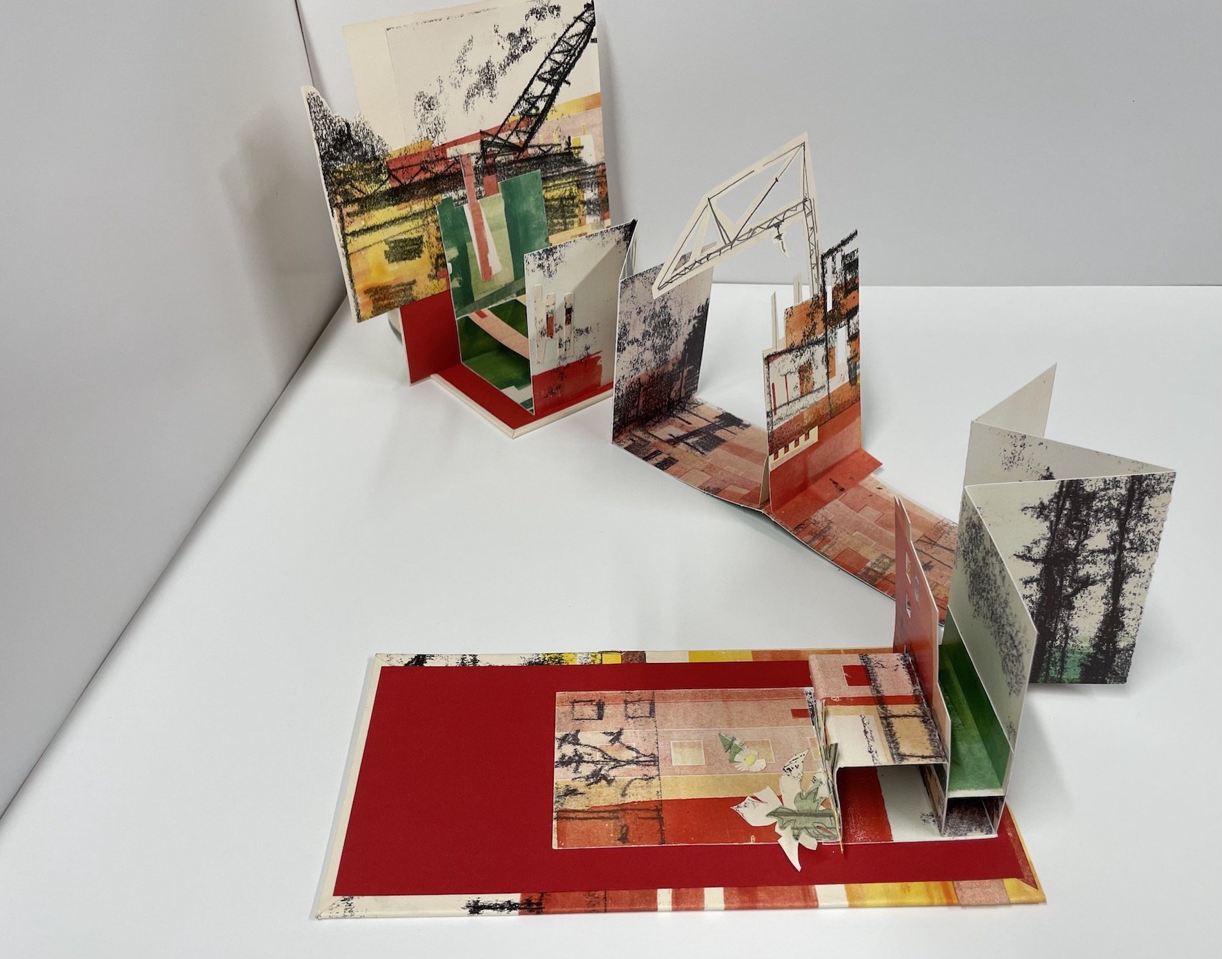
Name of the work: Built Environments
How many issues are there & has it been shown in public/exhibited? There is one issue of Built Environments which was exhibited in 2018 at 'The Illustrated Accordion' at the Kalamazoo Book Arts Center in Kalamazoo, Michigan.
Why was your artist's book created? Built Environments was created to document work from Tableaux, a mixed-media series featruing original, 1:12 dioramas and miniatures.

Artist: Philip Vaughan-Williams // https://phillvwilliams.wixsite.com/portiphillio
Artist statement: A UK based Visual Artist spanning over 20 years of practice. With a primary interest in materials, work manifests as 3d artworks, artist books, micro zines, postcards, digital photographs, drawings and mixed media assemblages, that often make comment on society, identity and the geography that is inhabited.
A history of Mail Art participation and archiving as well as making installation and performance work on similar themes as well as political comment and identity. Work also explores the tensions between the ephemeral and permanence, as well as what is considered beautiful or uncomfortable.
Name of the work: Bound I, II, III (2023)
How many issues are there & has it been shown in public/exhibited? Unique works (series of three pieces)
Why was your artist's book created? Bound I, II and III are a part of a series of artist book works exploring content not being revealed to the viewer, to read would be to destroy the artwork itself. Materials reflect the potential for a book to transfer ideas, sometimes of toxicity as well as knowledge. Making references to 'little black books' where secretive notes would be made. The act of binding the books references the making of books themselves, these works are a nod to a darker, more taboo side of life, one that does not always follow the conventions of beauty.

Artist name: Myrna Renaud // www.afaltadepapel.art / dancezine
Instagram: @myrnarenaud
Artist statement: Transdisciplinary artist from San Juan, Puerto Rico. Trained in modern and contemporary dance, the visual arts and expressive therapies.
Forty seven years of professional trajectory in New York, Texas, Puerto Rico, Barcelona, London, and Lisbon are dedicated to research, production, direction and performance of installation, post dramatic theatre, sound / word / language constructions, moving image, meta graphics, and teaching /mentoring / facilitating dance and site-specific experiences, pieces and projects. Artistic Director of En Situ Danza, an international dance, performance and moving image project, twenty three years in the making.
Dance, her fulcrum, remains the essence and DNA of her mark and identity as a Latin American woman from the Caribbean. Her work is primarily in the Spanish language, on purpose, by way of responding to the practice of inclusion through language. Renaud has full command of the English language.
Name of the work: A falta de papel / dancezine
How many issues are there & has it been shown in public/exhibited?
12 issues distributed in 3 volumes. 5 issues per volume. Volume 3 just published Issue #2.
This project will conclude with 15 issues in April, 2024.
It is online, for public consumption.
Ultimately, issues from the 3 volumes will be printed and the project will become lecture-demonstrations for Performing and Visual Arts public high schools in Puerto Rico and Minneapolis.
Why was your artist's book created? I wanted to learn and put in practice my skills in online publishing by way of translating from my vast experience with paper, to my newfound skills with digital media. The media and content produced in my dancezine has multiple applications, primarily in/for dance education with an inter/multi disciplinary approach and methodology.

Artist name: Fengxuan Zeng // zengfengxuan.com
instagram: @zengfengxuan
Artist statement: Zeng Fengxuan has been exploring the idea of the book as a conceptual construct, where the notion of the book becomes a fluid state that utilises memory, arguments, structure, and sequence to frame and advances art practices. This exploration of the book thinking paradigm coincides with the desire to discuss the connections & contradictions between cognitive biases and discourse among people. She mines and manipulates existing imagery, from her own oeuvre and personal experience—transforming and destabilizing relationships between objects and meanings.
Zeng Fengxuan's works consist of installations, sculptures, artists' books and moving images as the primary media. Trying to use books as a pattern of thinking and not just a biological material to use in art making, she experiments with various forms and materials, the situation constructed by the invisible book is only the vehicle of the concept. It is as much about the book as it is about its content.
The starting point for Zeng Fengxuan's work is usually emotional, intimate, and personal. Her family relationships depart from the depiction of them in traditional culture. Changing social circumstances and childhood transitions in different environments have sensitised Zeng Fengxuan to events, emotions and connections and triggered her artwork. However, this impulse was filtered out from the new mode of thinking and buried deep beneath the formalities of the work as the work progressed with rationality and analysis.
Name of the work: "Read me, please" -Cyclonone Sensepaedia
How many issues are there & has it been shown in public/exhibited? 3 copies. It has been shown on the Royal College of Art Degree Show 2023.
Why was your artist's book created? I've been trying to push the boundary of the conceptual structure of books, I believe that the book is beyond the material its self, it flows under the consciousness that constantly leads our thoughts and behaviors. I unfold this idea through three avenues: the foundational logic inherent to books, the nuanced act of reading and its sequencing, and the interplay between language and the dissemination of information. These inquiries serve as experimental investigations into the methodologies of art-making, enabling her to articulate her perspectives and viewpoints on the predetermined meanings, presences, and absences intertwined with objects, all within her self-constructed charter.
Cyclonone Sensepaedia stands as an addition to the realm of knowledge, challenging traditional conventions and venturing into the realm of enigmatic understanding. As part of the "Read me, please" series, this unconventional encyclopedia embarks on an cerebral journey that defies conventional boundaries and delves into the interplay between existence, cognition, and the complexities of consciousness. Constructing based on a self-created symbolic framework interwoven with existing knowledge systems, Cyclonone Sensepaedia traverses the domains of astronomy, geography, paleontology, mathematics, geometry, semantics, etc.
Artist name: A. Rosemary Watson
@line__space__form
@arosemarywatson
@arosemarywatson_art_studio
Artist statement: Fine artist exploring notions of memory (time place experience dream) through drawings paintings photographs video and artists books and encompassing chance intuition and spontaneity. Practice is primarily concerned with exploring a personal response to and forming a record of the constantly shifting and multi-layered nature of memory which blends and blurs over time into a personal version of history. It is a process that is continually explored developed and refined as the memories themselves constantly reshape reform and transform in the process of recollection, in which the memory-image has been reduced over time to an abstraction of line and space. The interest in artists books developed over several years as a means of expressing concepts, and book works have taken, and continue to take, a variety forms.
In recent years a body of work has developed as an open-ended ongoing print-based research project exploring the inter-relationship between the 2-dimensional printed image, book formats and the 3-dimensional form, where the abstracted memory-image has been fractured and fragmented by hand-cutting and folding blind embossed prints and emerges through the play of light falling across paper.
Member and organiser of the Sheffield Artist Book Centre and Bookness Collective artist book groups.
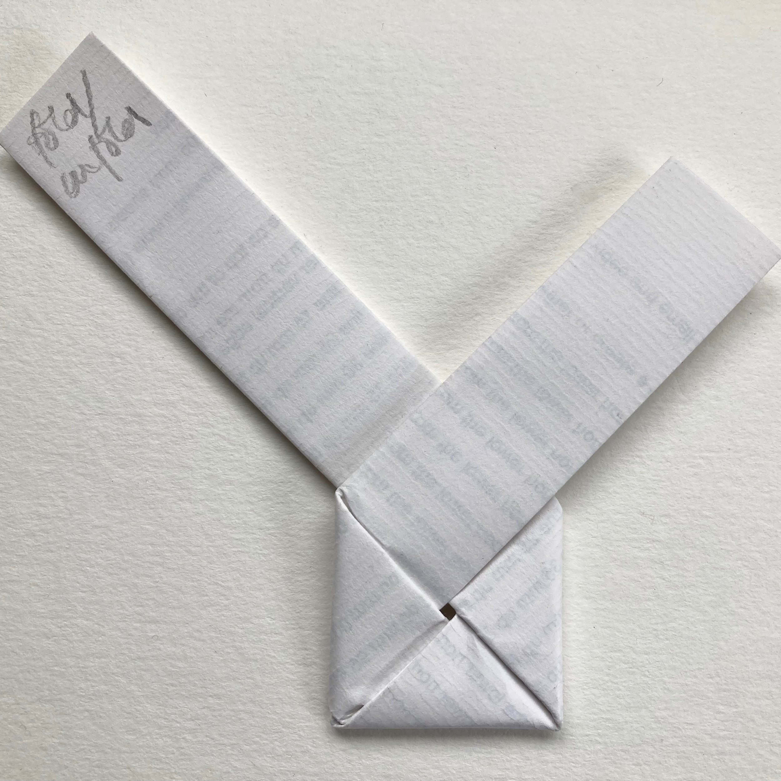
Name of the work: Fold / unfold
How many issues are there & has it been shown in public/exhibited? The book work has unlimited edition. It has not been exhibited but it has been exchanged with the tutor and some of the other participants of the ‘Bookness' course and shared at a meeting of the Artists Book Centre (Sheffield) artists book group.
Why was your artist's book created?
The work was created for a book exchange with some of the participants of the 12 month ‘Bookness' course with book artist Les Bicknell, taken during the pandemic.
The contents of the letter were influenced by the work of Sol le Witt and the Fluxus group which had been studied during the course.
The title is based on the concept of the book artist creating and folding the book form and the viewer / reader subsequently unfolding it, but who can also fold (and refold) it.
The nonagon / book form is intended to be opened and read as a letter, the contents of which invite the reader to create a book in accordance with the details / instructions contained in the letter.
The form is based on the letter locking technique (a type of ‘document security’ before the envelope was invented), which is classified as a nonagon, in that it has 9 distinct edges (a form common to Japan, China and Korea), however it is folded long to long side rather than side to short side.