kitsch artist and art writer
Bio
Catherine Ryan is a mixed media artist working in Dublin. Her background is in glass design. This influence is found in her vibrant use of colour and different shapes that she fuses together using acrylic paint. Objects are wired, glued, nailed onto the flat surface of the canvas, adding texture and blurring the lines between painting and sculpture. Her idealised cityscapes create space for every conceivable shape and for all colours. Using objects from paper paraphernalia to mobile phone parts also acts as a record of the material culture of the 21st century.
Catherine’s exhibition history includes the Royal Hibernian Academy, RUA RED and Limerick City Gallery of Art. Her work has travelled to the UK, France and the USA.
In 2020 she joined the online artists’ collective Nua Collective.ie. She is also a member of international artists Walk Bye.
Currently she is represented by Duke Street Gallery and The Copperhouse Gallery in Dublin
1 - Could you explain your practice? Only you know why you do what you do.
I make abstract mixed media cityscapes. I’ve always been drawn to cities; the people, the atmosphere, so many intertwining layers of humanity, seen and unseen. I like to push the limitations of the flat surface of the canvas. So I began attaching small objects as seen in my tribute to Dublin, Dublinski. The objects started to take priority, becoming bolder, bigger. My recent studies in Folklore also feed into my practice in terms of symbolism and methodology; for example, the belief in “found objects” carrying the psychic energies of the places where they were discovered.
I’ve always loved sculpture so my highly textured work combines painting and sculpture. I use bits of text from everyday ephemera to evoke the changing field of vision as you walk through a city; neon lights here, a billboard there. Walking is the best way to experience a city and my work encourages this act; moseying around, soaking it up.
My other work is Driftwood Beasties, one of which features in Haus a Rest, the body as landscape issue. Fantastical creatures that began in 2020 as a way to process all that was/is happening. Everything became adrift. Long beachcombing walks resulted in a mass of materials of driftwood, plastic, and rope. They developed features as the face is a universal and reassuring symbol. I was also thinking about how humans emerged from the sea...
2 - Is art relevant today? And your reasons either way.
Art will always be relevant, even if we fully evolve into cyborgs! Since the first cave paintings, humankind has felt the need to process life experiences through self-expression. This changes over time and acts as a mirror of the context in which it was produced. Artwork does not materialise in a vacuum.
Art comes from life experiences. Folk art, outsider art, or whatever you want to call it is just as valid as art found in more formal contexts, especially as most art worlds exist outside of the established and visible canon. The internet is the biggest development in recent times so that has created and influenced art, from traditional to glitch paintings, NFTS and art meme accounts. Like folklore, art develops alongside the human experience.
3 – We are always asked what other artists influence us, we want to know what art you don’t like, and which influences you?
I don’t like visually drab, overly artspeak-y, leaves-me-cold kind of art. The kind where the visual aspect is really dull. I was at an opening years ago where the art piece was a plain plywood table with printouts on it. Naturally, enough people left their drinks on it, interpreting it as a table. Visually it was very boring (miaow).
What I do like = I need something with a bit of oomph to it, the effort put in, ideally very colourful, plus imagination. Art with a sense of humour, humour being a powerful tool to satirise the establishment, power structures, and everything in between.
Some alive and kicking artists whose work I admire, in no particular order: Merny Wernz (UK), Carmen Quigley (IRL), Dead Princess (IRL), Gavin Lavelle (IRL), Rayleen Clancy (IRL), Saoirse O’Sullivan (IRL).
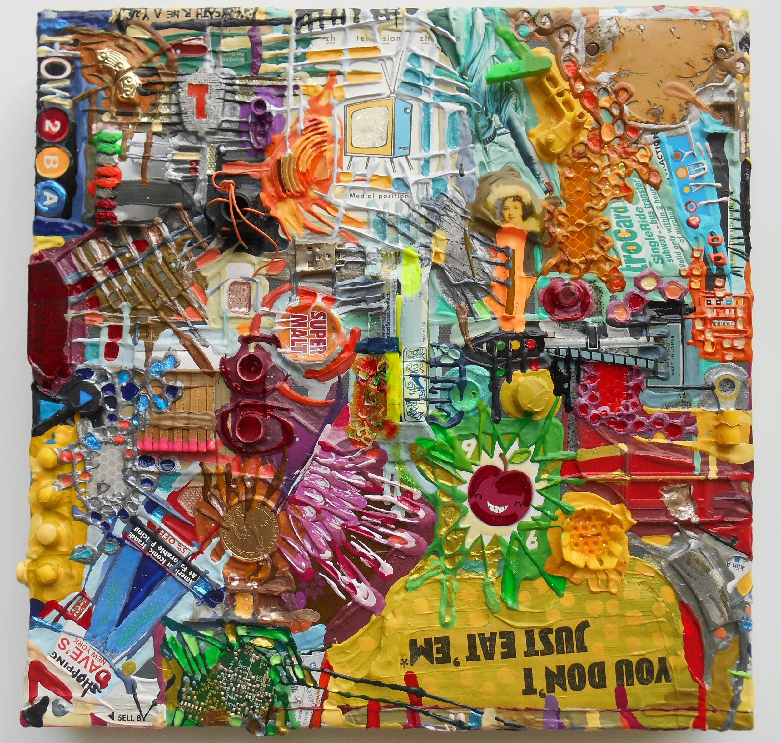
Title: How 2BA NY 4Way.
Medium: Acrylic and mixed media on deep edge canvas.
Year: @2016/17. First time shown in 2021.
And one really famous artist = Grayson Perry; epitomises the combination of artistic skill, understanding of colour, sense of humour, and biting social commentary that I love. His TV series All in the Best Possible Taste (spoiler alert) really showed that despite the visual expression of class divisions, people are more alike than they’d like to think.
A few words on kitsch; it is often described as being appreciated in an ironic way but I like it earnestly; the immediacy of vibrant colours, fantastic plastic, and a broad appeal. When I expressed an interest in kitsch back in art college, it was almost a taboo subject and I was told that one must first have very “good” taste in order to appreciate it. The whole area of aesthetics and what’s considered good or bad art is charged with emotion and people’s values and how they see the world. Studying folklore helped my understanding of personal expression, the kind that exists for its own purpose and is unselfconscious. So a cabinet filled with ornaments means something to its owner when each one is a gift from a family member or a souvenir from a holiday. The ornaments are like company, and they are infused with projected memories. Superstar kitsch artists like Jeff Koons have taken that sentiment and gone large with it. The field of kitsch is a very wide, sparkly spectrum!
4- If you could go back 10-20 years what would you tell your younger self?
I would say don’t forget that being an artist will always be your “real” job, irrespective of income or circumstance. Don’t be too hard on yourself and keep going! Maybe 10 years ago I should have joined Instagram but I wasn’t ready.
20 years ago I wouldn’t have listened to me, or anyone(!).
I’m philosophical and wouldn’t change anything as I’m more comfortable with myself now than when I was younger.
5 – If you could go forward 10-20 years what do you hope to have done or not done?
A big dream would be to exhibit in Japan, absorb the neon lights and kitsch of their brand of urban culture. Even bring a few smallies in a suitcase, do some street art and street craft. I never had a big life plan except that I need to create. As long as I find the time to make art then I’m happy. I hope to bring my artwork on tour abroad again.

Title: Dublinski.
Medium: Acrylic and mixed media on deep edge canvas.
Year: 2007.
Artist Websites linked: www.catherineryanart.com / www.driftwoodbeasties.bigcartel.com Instagram: @catherineryanart
Original Works: www.dukestreetgallery.ie Online Collective: www.nuacollective.ie Limited Edition Prints: www.thecopperhousegallery.com
.
******************
Resident artist Michaela Hall
The Garish and glorious
There are two types of an audience when it comes to taste, those who find the notion of the super commercialised tacky and of highly poor taste and those who revel in its cheesiness, sentimentality, and garish greatness. The latter is likely to be a fan of kitsch and the overload of commercial and popular culture that accompanies. Both Takashi Murakami and Martin Parr demonstrate this unapologetic celebration of the garish in their works in a way that demonstrates all the gloriousness that kitsch has to offer.
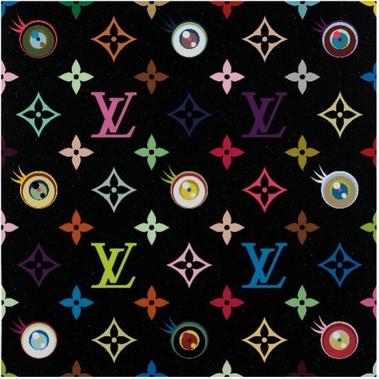
Japanese artist Takashi Murakami approaches his work in a way that combines influences from sci-fi, anime, and pop culture with traditional fine art painting and colour theory. He creates work that spans painting, sculpture, and film in which the inspirations mentioned above contribute to the creation of new characters, symbols, motifs, and repeated patterns. Murakami’s works are often gigantic in scale and confrontationally loud and garish, flooded with bright heavily saturated colours, referencing all those parts of popular culture that we know and love. In his 2018 ‘Kawaii Shop’ installation as part of his ‘Takashi Murakami in Wonderland’ exhibition in Shanghai, the viewer was invited into a space filled with bright illustrated floral characters. These characters were covering the walls in the form of a large mural and filling up shelves in the form of cushions and plushies along with pieces of painting and print mounted on the wall. The intense repetitive nature of the kawaii style ‘cutesy’ character repeated in a bold rainbow palette around the installation reflects the iconic Japanese kawaii trend of cute, fantasy characters whilst also reflecting the key arena to represent commercial culture- a retail store. This focus on Kawaii in a white cube gallery elevates the trend and blurs the boundary between kitsch and high art. Murakami has also collaborated with luxury fashion giant Louis Vuitton and in his ‘Eye Love Superflat’ piece from 2017, we see the iconic Louis Vuitton surface design altered in collaboration with Murakami to incorporate anime-style eyes and the same rainbow palette that runs through his ‘Kawaii Shop’ installation. Thus, again reflecting the blurred boundaries between popular commercial culture and high art- celebrating the kitsch and garish.

Alike Murakami, British photographer Martin Parr celebrates the garish, commercial, and pop culture elements in life that some may brand as low culture or poor taste. Reminiscent of images you may see in seaside towns on novelty postcards, his ‘Life’s a Beach’ series has seen Parr explore beach culture around the world for 40 years. With a focus on the bright saturated colour palette that is often present on heavily tourist-filled beaches, Parr focuses on the elements of the setting that are particularly inviting and eye-catching. Images in this series, some of which can be seen below are all highly saturated and focus on the familiar that most would associate with a beach holiday; a Budweiser beer, a good tan, a fun bikini, and some bright rainbow parasols. The dedication of Parr to a series of photographs capturing the everyday beach experience and everything that this personifies, in itself glorifies the loud garishness that is present in these photographs and setting to be beautifully composed and elevated like a high art painting.


Untitled Photographs from the ‘Life’s a Beach’ Series, Martin Parr culminating in a 2012 exhibition in Lyon, France.
What both artists manage to achieve in their works is to make the garish, over-the-top nature of kitsch desirable and inviting. Not only does the viewer appreciate the colour values and pop culture reference points in both bodies of work, but the pieces also transport the viewer to a particular setting or environment that provokes a sense of sentiment, fun, and adventure. Whether this is to a sci-fi, pop-filled anime world with Murakami or a seductive colourful beach scene in Parr’s photographs, both are highly appealing to the viewer. Both artists knowingly promote a popular and commercial culture within their work and uncover the glorious nature of the everyday elements of life that we know and love with a twist that keeps us on our toes, transforming the everyday that we know into an entirely awe-filled and wonderful dose of escapism.
*********************
Kitsch
Hi, I'm Andrew a bi creative based in Pendle. My output is usually print-based, collage, and zines, but I also blog online. The catalyst for my work was taking part in a body-positive illustration project which asked: "what is a body?" Is it anything more than this thing that keeps us alive? My work usually involves using photos of my nude torso to talk about the passing of time, irregularity, and disintegration. Both of ourselves and our environment. More broadly I often write about wanderlust, dysfunction in the family, and our misremembered pasts.
My zines are limited and quickly out of print but you can find a flavour and read more about me here: https://weirdobrigade.com/2021/01/07/meet-this-zinester/
I'm @cavedweller71 on most social media
I blog less often than I should here: cavedweller71.wordpress.com"
For a number of reasons, I'm never sure how best to describe my dad. Many would call him a hoarder. He'd explain this away by saying he just wanted to own every bit of tat on the planet in case it came in handy. He could think of nothing better than entering Word Search competitions for a chance of winning something he would never use. Women's curlers, fondue sets, and rotisseries were left behind when he died. There stacked with recipe books for microwave dinners. So yes the future did eventually come to the industrial north. I think it was his psyche's flipside. He started as a policeman and then worked for Social Services. He dealt with the order. He dealt with straight edges. Away from this life, he desired flamboyance. He desired garish. He desired cuddly toys which squealed 'I Love You' when squeezed.
I'll never forget that wall when you walked into his flat. It was almost as though someone had asked for both random and tacky. Give me 'you' in a million muddled hung-up items. If I was charitable I'd call it eclectic. There was a pair of novelty pink plastic 'love handcuffs' (I never asked why). There was a photograph of him and his wife at a holiday camp posed with some poor soul dressed in a badly fitting bear costume. There were fine if rather cutesy Limoges and a Pendle landscape. There was some dubious calendar onto which he added all his hospital appointments. In the corner, there was a strand of tinsel that nobody could reach. It baffled us how it actually got up there. I guess at least he had a bit of Christmas all year round.
I'm not sure if you'd call it kitsch. That suggests a degree of knowingness. Something that had a mass appeal at a moment in time but then fell out of fashion. A bit like legwarmers and 'Frankie Says...' slogan t-shirts. I don't think my dad followed trends he just picked up stuff he liked. A lot of it came from trips to the seaside. From those neon fronted arcades on the front where most things cost a pound. From arcades brimming with candy floss and saucy postcards. I don't think the objects on the wall mattered for what they were. It was the story behind them. He picked that up on the first time they stayed together. That one in the same year he had her name crudely tattooed on his arm. They were his life told through ephemera.
Perhaps kitsch is just nostalgia fed through a kaleidoscope? And perhaps life is nothing more than constantly rearranging things. Placing things close to each other and then moving them apart. Seeing how we feel. Does pink ever go with blue? Nearly all of my dad's belonging have now gone. I didn't have the attachment or desire to keep hold. They would just be boxed away if I took them which felt a shame. I took them to a local charity shop hoping the cycle would start again. Someone picking up a little piece of him to brighten their world. Sure they wouldn't know its history and only sees it for what it was. A curiosity. Something that made them smile. Maybe something that reminded them of growing up. Or of dreamlike times which may never have happened.